
When Kraft Simulation Becomes a Strategic Choice
Designing a label that looks natural is one thing.
Designing one that balances aesthetics, production constraints, sustainability and cost efficiency — is another.
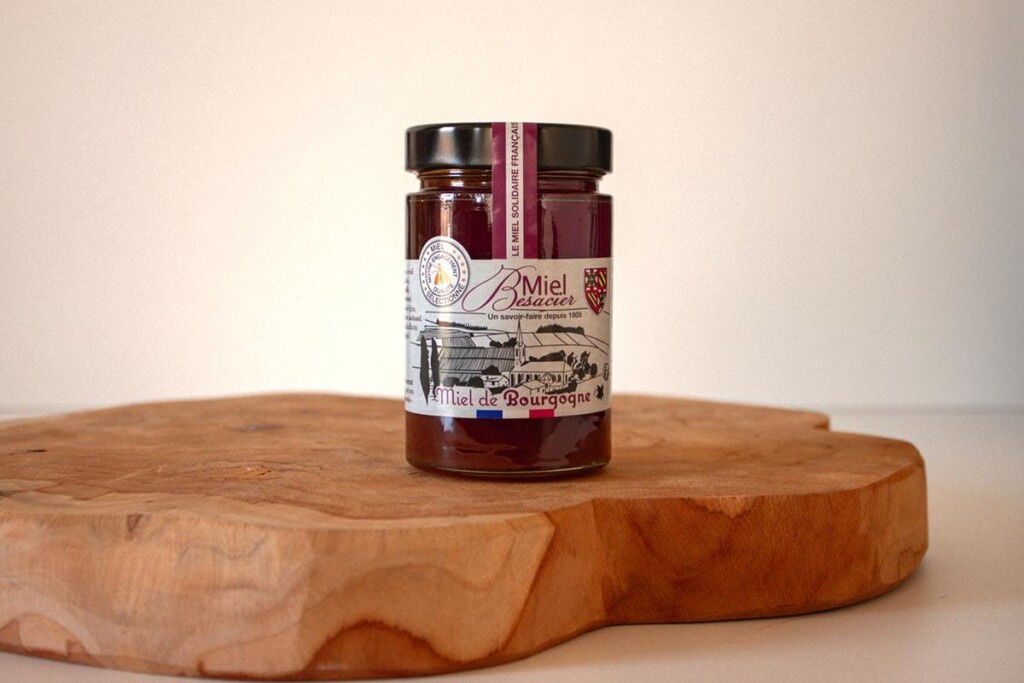
The label for Miel de Bourgogne is a clear example of how visual authenticity does not always require raw kraft paper — and how simulation can become a strategic advantage.
The initial objective: natural, authentic, consistent
From the beginning, the brand’s goal was clear:
to achieve a natural and authentic look aligned with its positioning and regional identity.
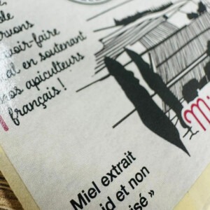
Real kraft paper was considered during the design phase. However, practical limitations quickly emerged — particularly in terms of moisture resistance, print performance and cost efficiency.
Ultimately, the decision was driven by visual precision and production control.
“The deciding factor was the visual effect, closely followed by print quality and finishing options.”
— Besacier Team
Instead of using real kraft stock, the brand opted for a printed kraft simulation on a classic paper material.
This allowed for:
- stronger and more controlled color saturation,
- better compatibility with finishing options,
- improved durability,
- and greater cost flexibility.
The result: a natural aesthetic — designed, not imposed by material limitations.
Technology as an enabler, not a constraint
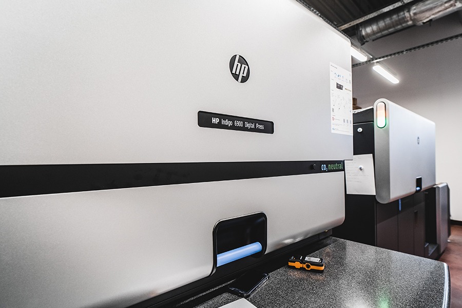
The label was produced using digital printing technology.
Beyond visual quality, flexibility played a decisive role — particularly for short runs and the ability to make quick adjustments.
According to the client
“We are very satisfied with digital printing, both in terms of rendering quality and the flexibility it offers, particularly for short runs and quick adjustments.”
— Besacier Team
Digital printing also contributed to sustainability objectives.
“Opting for a digital printing solution allowed us to reduce waste associated with overproduction.”
— Besacier Team
By eliminating the need for printing plates (polymers), reducing setup waste and allowing precise volume management, digital printing provided a solution that was both operationally efficient and environmentally responsible.
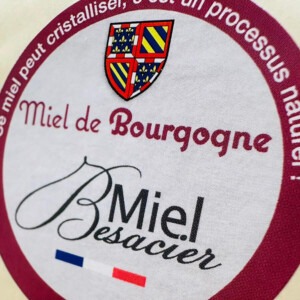
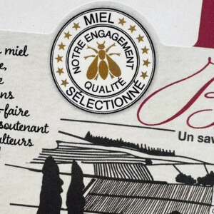
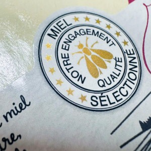
Silver ink instead of foil: premium without excess
The metallic detail on the label — the bee emblem — was achieved using metallic silver ink instead of hot foil stamping.
This was a deliberate choice.
“The choice of metallic silver ink over hot foil stamping was intentional: it allowed us to achieve an effect at a lower cost and with greater flexibility in implementation.”
— Besacier Team
The effect remains refined and elegant — without introducing additional material layers or increasing production complexity.
A reminder that premium perception does not necessarily require the most technically elaborate solution.
Brand impact: when simulation becomes identity
Today, the kraft simulation is no longer just a design decision. It has become part of the visual identity across several product ranges.
Interestingly, the client notes that external feedback has been minimal — which can be interpreted positively.
As they remark:
Positive feedback is rarer than negative.
Internally, however, the perception is clear:
“Our teams perceive this product as artisanal and high quality.”
— Besacier Team
And ultimately, that internal alignment is often the strongest indicator of brand consistency.
The Role of Technical Partnership
Strategic decisions rarely rely on aesthetics alone.
In this project, technical consultation played a key role in validating the final direction and anticipating potential constraints.
“The technical support was decisive in our final decision — helping us validate the options and anticipate potential constraints.”
— Besacier Team
Responsiveness, expertise and transparent pricing were highlighted as essential elements of the cooperation process.
And when asked whether they would recommend printed kraft simulation to other producers, the answer was clear:
They would not hesitate — especially for brands seeking to combine natural aesthetics, print quality and cost efficiency.
Conclusion: designed authenticity
This project demonstrates a broader principle.
Natural appearance does not always require raw kraft paper.
Premium positioning does not always require foil stamping.
Sustainability does not mean compromising control over print quality.
Sometimes, simulation is not a compromise.
It is simply the smarter choice.
